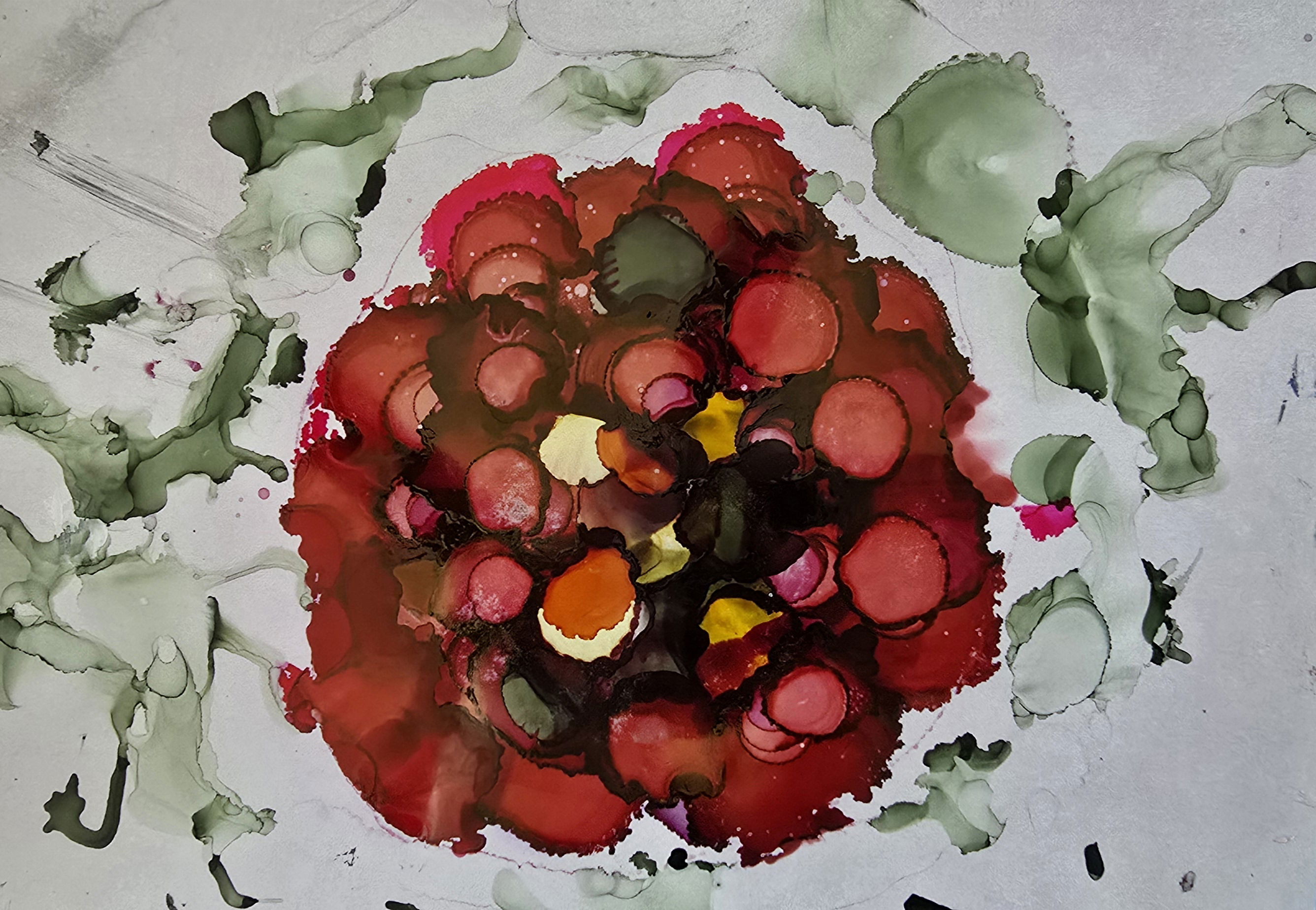
Beginning at the Beginning

At the very beginning of the creative process the question of color always comes up first. It is as or more important than shapes, or design, or balance. Color is key and how to get the color is equally as important. Here our subject matter is a red flower bloom so naturally the dyepot is filled with red dye. Or is it?
I tell my students to take their source subject, no matter what it is, and find 10 distinct colors. I have them write them down and then we discuss how to recreate them. It is best to use a color wheel and dyed swatches to match the colors the way you want them. I am very picky about the values in my projects. How light or how dark makes a huge difference in the final result. Have you ever learned about value?
Using a commercial sourced photo, I create a rendering in one of many mediums and fuss with it until I am satisfied that I have something to refer to during the dyeing and hooking process. I try to include all of the colors that I can see in the subject in that rendering.
The rendering above is a recreation of a picture of a red peony made from alcohol ink. All of the colors from the commercial photo are included in this mockup.
I use a color wheel and select 3 main colors that are most prominent in the flower. I chose Magenta, Fuchsia, and Red. There are also green, orange, and yellow.
I choose to use a dye that can handle wool and natural animal fibers and is wash fast.
For this project I choose to make a 6-way gradation of light pink, and a 6-way gradation of medium to dark red. In one skein of red I chose to put avocado to knock the brightness off just a bit because green is a complement to red and we know from color theory that complementary colors mixed together produce a dull new color. I don't put equal amounts in so I don't create a new color, but I get a nice subtle red. In one skein I chose to add pumpkin orange to give it more tang. Red flower petals are anything but solid red. Look at them in nature. Under the sunshine. Look at them as you sketch them in your notebook. Write the colors down that you see in natural light as these are the closest to real. Color becomes a big part of the first steps of planning a project.